VISUALIZATION PROJECT
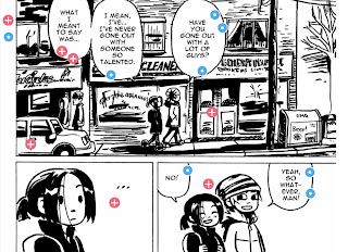
For this project, I decided to do an annotated image. I felt that this was the most appropriate because the students will be reading a graphic novel, and they probably won’t know certain graphic novel terms that are important or what to look for when they’re annotating. I chose this image specifically because it also has some things that can be annotated based on the lens the students would be using for this unit (which is gender/gender norms), and it has a few good examples of graphic novel vocabulary words I would want students to know. To differentiate the two different reasons for annotating, I have added two different types of clickable points. The blue circles are showing what to look for/how to annotate for gender norms within the story. The red circles show different graphic novel terms and what they mean.
This process definitely deepened my understanding of graphic novel terminology and how authors/illustrators use all of the space on the pages to show things that might not come across in the things that characters are saying. In a graphic novel, the pictures are just as important, or even more important sometimes, than the words. I used the graphic novel terminology in my third blog post as definitions to go over when teaching this book, but I think that going over the definitions in this way is much more helpful. It’s hard to describe what chiaroscuro is without having an example of it right there on the page for students to see it plainly.
Before this project, I had never even seen or heard of an annotated image. I have definitely annotated images in the past, but it was on paper and not nearly as “put-together” looking as these types of images are. I think that I will definitely implement annotated images into my curriculum in the future. I think they are especially helpful for annotating graphic novels because there isn’t usually a ton of room on the page to write anything, so this can be a way for students to fully develop their ideas/questions they have while reading without having to just add a post-it note in their books. I think that, visually, it also adds a good amount of contrast to the page by adding the little clickable dots, so students can easily navigate their annotations. It’s also more interactive, so I think that students will appreciate that as well.


Katie! I love this idea, graphic novels always seem like such a great balance to explore with students because of the inherent mix of visual and text. I think that this is a great idea and tool for students who are reading graphic novels. Having them consider not just what is happening in the story but the composition of the page and how that figures into how the story is being conveyed through panels and other parts of graphic novel design. I hope you end up using this with your students because I think that it would be a great unit even!
ReplyDelete